Thursday, March 28, 2013

Speeds Kate 2.0

Finally finished up shading Speeds Kate's poster girl drawing from last year!  I thought about leaving it on a plain background, but of course my caffeine-addled brain just couldn't leave well enough alone.  So here it is!


Aside from the shading, I didn't really make any changes to this drawing other than changing the color of her knee pads to reflect the ones she has now (they match her gloriously purple skates!).  I was thinking about changing her hair color too because for a while it was this gorgeous teal with a purple pivot stripe running down it.  By now it's returned to its natural blonde so I left it as-is.

In case anyone is wondering about what fonts were used--> All Ages and Ghetto Marquee 

Btw, I borrowed the title from a fb comment left by our bout photographer, Steve Jurkovic :)

Hope you guys like it!

Wednesday, March 27, 2013

Speeds Kate and The Superhero Slam

In June of 2012, my league hosted a bout called "Superhero Slam."  While roller derby bouts are always fun, this one was especially so for a couple of reasons.  First of all, as we had newly formed a B-team, this was our first double header.  Double the derby goodness!  Second, we all really got into the superhero spirit.  Lots of us donned masks and capes--Some of us even full-on costumes!  And by someone of us, I mean me :P  I had made a Robin (as in Batman's sidekick) costume years back and brought it out one last time to wear while I wasn't skating.  I'm sorry to say that I don't really have any good photos of me wearing it (at least since getting into better shape), but I'd be lying if I said that it wasn't pretty freaking awesome.  Even had a working utility belt :)

The league voted in Speeds Kate as that month's poster girl.  Easily one of the best skaters I've seen, I can only wish that I had half her speed, footwork and tenacity.  And despite her tiny frame, Speeds has this intensity to her that I hoped I'd be able to accurately capture in her drawing.

 
She really does stick out her tongue like that.  Sort of a Speeds Kate trademark :P


From a compositional standpoint I know it looks like an awful lot of colors and patterns, but I based her boutfit on what she had actually worn.  Like those shorts and those tights--I did not make those up.  The rainbow socks I did, but really, those are a staple in most derby girls' wardrobes (I am the rare exception).  And yes, she really does have crazy-purple skates :) 

Because I was dealing with a major time crunch, I unfortunately had to leave Speeds' drawing in flat colors like you see here.  However, it was always my intention to go back in and give it the fully shaded color-treatment.  I don't have it here for you now, but it is almost done!  So until then, here's a look at her bout poster to tide you over.


With the bout being superhero-themed and all, it only made sense to design the poster to look like a comic book cover.  Again, I had to keep the background fairly simple because I just didn't have a lot of time.  If I were to go and re-work this design, one of the things I'd do is incorporate some Roy Lichtenstein-inspired benday dot patterns, in addition to putting more effort into the title design.  I had included a drop shadow behind Speeds' drawing to help her pop off the page more, but I hadn't noticed until it was too late that it had disappeared.  Eh well. 

Anyway, hope you guys liked Speeds' drawing!  And I'll be sure to post her newly re-colored drawing here once it's finished!

Thursday, December 27, 2012

Belated Seasons Greetings

Click to see it at full size, yo!
I realize that Christmas was 2 days ago, but here's a little holiday card that I doodled up for my roller derby league.  I only decided to post it here now because I haven't updated this blog in quite some time.  There's plenty more artwork to post, I just need to get around to it...

This was something I just doodled up for fun.  I took a silly team photo that we had and added hats, scarves, antlers etc., and I made sure to photoshop in a photo of our mascot.  That's right--we have a mascot.  His name is Roary Feldman, and we love that lion! Anyway, hope some people got a chuckle out of this.   

Thursday, August 30, 2012

Smack to the Future with Thikicole and Katty WhompAss

Our 4th bout of the season was a salute to the totally tubular '80s.  Always up for some nostalgic fun, many of our league members decided to celebrate in style!  There were ruffled skirts, neon plastic accessories, off-the-shoulder tops, thick waist belts, teased out hair styles and mullets as far as the eyes could see (through "blinds" shades of course).

Despite all of the garishly colorful aspects of the '80s, for some reason I had a hard time pinpointing what sort of imagery to use for the bout poster.  I think the problem was that it just felt like there were too many possibilities (Glam rockers?  Hideous fashions?  Corny TV shows?  The grody lingo?).  After all, the '80s were nothing if not a decade of excess.

This time around I was going to feature 2 skaters as well (#68iou--Thikicole and #412--Katty WhompAss), so I figured that it was probably best to keep the design simple.  I just had to make sure that I stuck with some distinctly '80s design elements.  So of course, I had to use hot pink!  And nothing clashes with hot pink quite as well as lime green. 

From there, the plan was to make the bout flyer resemble a cheesy '80s movie poster.  Because I was drawing 2 skaters, the "back-to-back buddies" pose seemed not only natural, but necessary ;)


Totally having a Corey & Corey moment right now.

Not exactly a fan of Duran Duran either, but Nagel
did the artwork for the album, Rio.
Although I would not call myself a fan of his, I also drew inspiration from artist, Patrick Nagel.  His work is just so dang iconic of the decade.  While Nagel would reduce down or stylize the physical features of his subjects so that they all looked alike, I wanted to make sure that Thiki and Katty both retained their individual appearances (what's the point of drawing real skaters if they look like they can be anyone?).  So, I drew them as I normally would and instead adopted some of his other artistic conventions.  This is primarily evident in color usage.  His subjects were always white-skinned (literally) with very minimal, flat, gray shading and limited color elsewhere in the composition.

Also, they were often topless...but we're not running that sort of an organization here :P

Nagel also made use of simple, often sharp, geometric backgrounds to offset the sensual curves of his subjects.  I used the shapes to frame the skaters instead of placing all those jagged edges behind them, but even so, the geometric shapes are there.

And just as a side note, those little skater silhouettes are from a recruitment poster that I had designed for The Dames about a year ago.

So there you have it--the bout poster for "Smack to the Future," featuring Thikicole and Katty WhompAss! 

Fonts used: Trajan, Forgotten Futurist, Badonk-a-donk, Chronicles of a Hero


Sunday, August 19, 2012

N7 Armband

Last night we debuted new-new team uniforms (it's kind of a long story how we wound up getting new uniforms again, so suffice it to say that it was necessary).  Along with the new-new uniforms, many of our girls decided to order armbands for themselves as well (skaters are required to display their numbers on both arms).  Taking a permanent marker to your arms works just fine, but some opt for the armband because marker often rubs off and needs reapplying.  That should come as no surprise what with all of the sweating and shoulder checking derby girls do.

Instead of ordering armbands I wanted to design my own.  I made some for myself before, but I had to retire them after a couple of months or so.  The issue was that the fabric stretched over time and would droop or fold over itself, obscuring the numbers.  And that's problematic because you can be penalized if your numbers are not clearly displayed.

The old armbands were simply sewn "tubes" of interlock (T-shirt-like) fabric and fabric paint.
For my new armband (I wound up only making one, haha), I wanted to make use of elastic bands that would keep it firmly in place.  The nerd in me also wanted to incorporate a visual element that would serve as a nod to Mass Effect, the video game series that inspired my number choice.

Commander "Jane"/"John" Shepard in N7 armor.  Hmm...it bothers me that whoever made this wallpaper simply flipped Femme-Shep so she looks like some mirror-reflected doppelganger.

Ideally I wanted to make an entire sleeve with the n7 armor stripe running down it, but it seemed likely that it would bunch up under my elbow pad and feel like a hindrance. I kept it just long enough to run from under my shoulder to just above my elbow.  So it's short in comparison to a sleeve, but it's still long as far as armbands go.


Obviously I opted for a green stripe (one of our team colors) instead of the classic red stripe.


There are imperfections galore, but I'm pretty pleased with how it turned out.  Despite the simple look of it, this armband is deceptively much more complicated that the old ones.

First off, the old armband was simply a poorly sewn "tube" of green fabric.  And it wasn't even the right shade of green...  This armband tapers towards the bottom for a better fit.  Plus it has elastic bands sewn in to keep it snug and in place.

I used a thicker, 2" wide elastic band at the top to maintain rigidity for the number, and a much thinner elastic (1/4" maybe?) on the bottom.  The stripes are made from old T-shirt scraps and twill tape.  Despite my best efforts, the threads of the will tape were fraying/unraveling, so I brushed the seams with a couple of drops of epoxy.  While I would have loved to use iron-ons or patches for the numbers, I didn't have any available (at least in the font that I wanted...I'm a dork, I know), and used fabric paint instead. 

I could see myself making another one of these armbands sometime soon with some minor adjustments.  But for the time being this will work just fine!

-----Update----
I never did make another one!  Lol!  But here's a photo of how I wore the arm band, along with some white and green duct tape over my elbow pad to give it more of that full length N7 Stripe!


Thursday, August 16, 2012

She flies through the air (and glides on the track) with the greatest of ease...

As you know, the first 2 bout posters featured 2 of our actual skaters.  By the time the third bout rolled around, drawing a derby girl started to become a bit of a tradition.  However, instead of selecting the skater myself (as I had done with Millie and Pink), I decided to take a vote and let the league choose for themselves.

It basically works like this:  League members send me their votes after each bout for who they would like to see featured next.  All members (skaters, refs, NSOs and the coach) are allowed to vote on whoever they'd like, except for the skaters who have already been featured that season.  The winner isn't revealed to anyone until the poster is finished.

Now the powers that be (meaning our bout committee), decided to call our third bout "Battle Under the Big Top."  It should be fairly obvious then what our theme was :)  While we can't always provide half-time entertainment relative to the theme, we managed to find circus performers to put on a show for us.  Jugglers, balloon animals, acrobatics and comedy acts...it was a good time and the kids really seemed to enjoy it.

Anyway, the vote for our poster girl was pretty much unanimous because one of our skaters has some circus experience!  And that's Give 'Em L!

She really does have those stockings and socks...And I have no clue how she manages to keep those glasses on her face!

From the rough sketch...


To the final bout poster!


That's right...she's riding an effin' lioness!

 I was going for an antiqued, old-fashioned circus poster in the flyer design.  At this size it's hard to see it, but the background has an aged paper texture.  For some reason I found it highly amusing that I wound up drawing a lioness for a roller derby poster.  And don't think that I wasn't tempted at some point to draw some skates on that thing ;)

As you can see from the rough pencils, L and the lioness were initially drawn together.  After I scanned it in, I decided to draw the two as separate images that could be easily rearranged as needed to fit the composition.  Plus, I figured that L might appreciate having a drawing of herself sans lioness, just in case :)  Besides, If I ever decide to, I can re-use the lioness for some other design, seeing as how we have 2 of them adorning our league logo.

Ah, and I almost forgot my little plug!  In addition to being just an all-around awesome person, L is also the author of a newly released children's book!  It's called Eight Days Gone and is about Apollo 11's mission to the moon!  Apparently the Reading Rainbow folks have also recently purchased the rights to the digital version for their online app!  Go get yourself (and all the kids in your life) a copy now!  RIGHT NOW :)
 

Tuesday, August 7, 2012

Pink POW-Her Ranger

For our second home bout of the season, I decided to feature one of our Team Captains, Pink POW-Her Ranger, as the poster girl.  And why?  Because she's flippin' awesome.  'Nuff said.

Instead of just posting the finished poster, I thought people might be interested in seeing a sort of breakdown of how I work on these drawings.  So first thing's first.  Research!  Yes, research.

When I'm drawing actual people, I try really hard to strike a balance between my comic/cartoon style and maintaining a believable resemblance (instead of generalizing all of their characteristics).  So, before I even pick up a pencil, I start by gathering a bunch of photos.  Seriously.  If you were to peak over my shoulder at my computer, you'd be convinced that I was stalking them...

Aaanway, I study the photos as best I can, not only so I can get a feel for the person's face and physique, but also an understanding of how that person stands, how they carry themselves, how they move their bodies.  Oh, and their boutfits :P  From there I draw at least a dozen or so tiny, thumbnail sketches until I come to a pose that I like.  That's when I move on to the pencil sketch.    
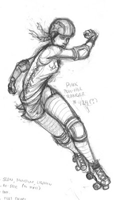
My original pencil sketch, scribbley notes and all!
  

After the pencils are done (I use the term "pencils" interchangeably with "sketch" by the way), I scan it at a high resolution to Adobe Photoshop. The sketch is actually pretty small--only about 5 or 6 inches tall.  Because the flyers we have printed are 11"x17," I resize the sketch to about that size.  Normally, taking a small image and resizing it larger is a bad idea because of loss of quality (like when an image pixellates), but in this case I don't mind.  I'm actually going to wind up "tracing" my new "inks" (the outlines) over the pencils anyway, so that I'll wind up with a new, large, high quality drawing.
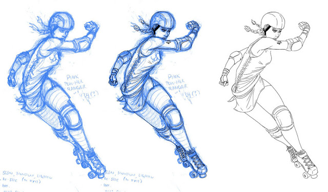
Image 1-Blue sketch/pencils, Image 2-Black Ink layer over blue pencils, Image 3-Inks (line drawing) layer

Before I start inking, I adjust the sketch color to something other than black.  This helps me see which sections I've already inked and which parts still need to be.  If you look closely at the first drawing (the blue sketch), you'll also notice that I edited certain parts of it.  For example, I realized that for a foreshortened view of her leg (the one that comes out in front), it needed to be "shorter" than how it was drawn originally.  I can't remember, but I may have also edited the size of her head.  My anime-loving background has left me with a tendency to draw heads a bit too large for the necks that support them...

After I'm done editing the pencils, I move on to inking.  I create a new layer over the sketch layer to draw on (for those unfamiliar with Photoshop, think of it as placing tracing paper right on top of your drawing).  I stick with a small brush size (5 pt) and begin tracing my inks over the pencil lines.  The middle image is what the drawing looks like when I have my inks layer on top of the sketch.  Once I'm satisfied with the inks, I then discard the sketch layer.  That's what you see in the third image--A clean line drawing (my inks layer by itself).


Image 1-Grayscale shading layer, Image 2-Flat colors, Image 3-Grayscale shading with flat colors.
All layers are sitting underneath the inks layer.

After the inks are finished, I can choose to either start shading (image 1) or adding in flat colors (image 2).  It doesn't particularly matter which step I do first, as long as I do both on separate layers underneath my inks layer.  The shading is done with a couple different shades of gray, trying to keep in mind where my light source is.  Flat colors are easy enough--Just stay within the lines!  After both are done, I change my shading layer to sit transparently over my flat colors (I set the shading layer to "Multiply").  That's what you see in image 3.  It's gettin' there, but the drawing looks a little muddy, doesn't it?
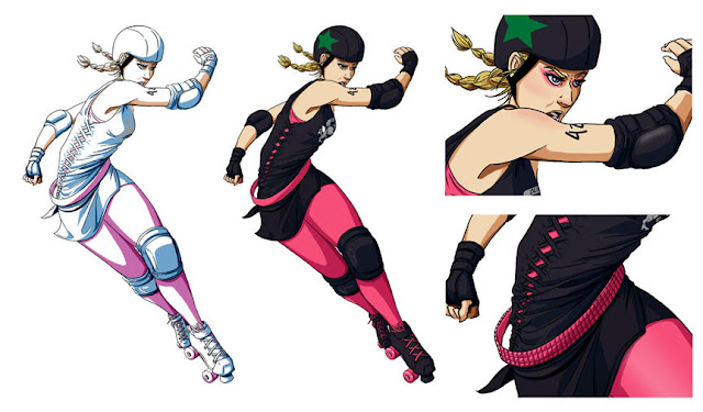
Image 1-color adjusted shading layer, Image 2-flat color layer combined with adjusted shading
Images 3 & 4-close up detail shots.

 I then take the shading layer and edit the color balance.  For the shading that sits on warmer colors (like her skin and anything pink), I adjust the color from gray to something warmer.  Cooler colored regions have their shading changed to cooler tones as well.  Image 1 is what that shading layer looks like after I'm done making my adjustments.  Image 2 is what the drawing looks like with the adjusted shading layer added in.  Now Pink [POW-Her Ranger] has gone from looking sort of pallid and lifeless to ready to kick some arse!  Oh, but there's more.

It is at this stage that I allow myself to work on all the little details that really make an image pop.  As you can see from the close-up images, I added in a bunch of details like her eye-make up, her flushed cheeks, the dull shine on her elbow pad's plate and all of the ridiculous little pyramid studs on her belt. 

Yeah, I really hated that belt...haha.  And it seems like such a trivial detail to labor over, I know.  But you have to admit that it really helps polish off the final image.


Now the drawing is done and ready to be dropped into the flyer design.  I'm not going to go into how I work on that because I don't even know what I'm doing half the time...hahaha.  But I'll leave you now with a look at the flyer she was featured on.
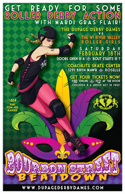
By now I've designed a handful of different bout posters, but this one is still my favorite!
Fonts used: Circus, Feast of Flesh BB and Market Deco (all found on dafont).