Tuesday, November 29, 2016

My Derby Wife: Kid Vicious!

Omg omg omg, I am SUPER excited to FINALLY get to this particular blog entry!  Why?  Because it features my derby wife, Kid Vicious!  

*MUPPET ARMS!!!*
Kid and I (and our other derby wife, retired skater, Hitty Hitty Bang Bang <3) knew each other for a bit before we started skating because we worked together.  And experiencing the trials, tribulations and triumphs of Fresh Meat brought us so much closer together.  And that was really for the best considering that between work and derby, we spent more time with each other than without ;)

Now Kid is legitimately a very special little snowflake in that I've never ever really met anyone quite like her, and I'm not sure that I ever will again.  If you asked her for he favorite color, it would have be to rainbow.  Favorite animal?  SHE LOVES THEM AAAAALLLL!  Also maybe unicorns.

And turtles.  And cats.  And ferrets.  And snakes.  And puppies.  And--well you get the idea.  

No, but seriously, she is wonderfully quirky and bubbly.  A passionately well-read hippie weirdo who is ever so lovely and loving.  In her eyes, the ridiculous is ridiculously joyful.  Her head remains up in the clouds at all times, but her feet are firmly rooted in the earth (barefoot no less).  And science.  Because she really f*(&#%!  loves science.  And she probably knows more about your favorite nerdy fandom than you do.   And last, but not least, though her real name suggests it, it is definitely not a reference to Australia.  Which is a shame, really, because everything is better with an Australian.  

Yeah, I realize that most of that jibberjabber doesn't make much sense.  Unless you know her.  Then it makes perfect sense.  

Anyway, enough of this gooey love-fest!  It's time to show you her drawing!  


Remember how I said that Kid loves rainbows?  Yeah, she actually owns those rainbow tights in the drawing.  And her hair has been all sorts of beautiful shades of the rainbow over the years...Including AT HER WEDDING.  

Seriously.  Freaking Majestic.

Actually, even in the drawing itself, the rainbow hair was the most fun to do.  If only there wasn't a helmet covering so dang much of it, haha.  


I left off the logo, but I'm pretty sure most derby people can
easily tell which  brand these knee pads are ;) 

See?  I told you!  Practically everybody had these skates!
Including me!


Both Kid and Viral Temptryss, who was featured in the last blog post, actually shared the limelight on the same bout poster back in 2013.

Omg, 2013.  I am like 3 years overdue in posting this...

...I am really bad at this.

Now, I am sad to say that Kid and I no longer play for the same league.  She moved back up to Minnesota last year in order to settle down out there.  And get married and junk.  Ya know, grown up stuff.  So while it does make me super sad that I don't get to see her rainbowy goodness all the time, I am happy knowing that it's for all the right reasons.  The best reasons!

Besides, though she may now be legally married, she's still derby-married to me ;)  

LOOOVE YOU, WIIIIIIIIFE <3


Wednesday, October 5, 2016

Well hello there! Long time no see! Meet my friend, Viral!

Hooooly craaaap!  It's been OVER A YEAR since I updated this art blog!  I may very well be a terrible person, or at least terrible at keeping up with these things.  I won't promise to be better about posting on the regular, only because I know myself all too well...  but I can try...

Despite how long it's been since my last blog entry, I actually have been been working on different derby-related designs fairly consistently.  So I do have quite a bit that I can update with.  It's just a matter of knuckling down to write about it.  Eh?  Eh?  See what I did there?

...Look, I haven't slept much in the last couple of weeks...this is about as sharp as my wit is going to get.

Anyway!  Let's finally get to the next long-awaited featured drawing :)


Then: #H1N1, Viral Temptryss
Now: #99, Viral Temptryss
This is Viral Temptryss!  Viral is just about one of my favorite people ever.  She's so laid back and mellow and consistently has a positive attitude.  She's always nothing but supportive of her teammates and always, always gives it her all.  Oh, and she has HIPS OF DOOM.

I really cannot emphasize enough how amazing Viral's hips are.  In general she's truly is a skilled skater (I wish my footwork was half as good as hers!), but she has this sort of signature swerve that is both beautiful and deadly if you're on the receiving end.  

Oh lawd, it's funny how old I can tell this drawing is.  Even if I hadn't drawn it myself, there are a few giveaways.  Like her skater number.  When this drawing was done, her skater number was H1N1 (VIRAL Temptryss...H1N1...get it?  Or are we just dating ourselves here?).  However, in December of 2015, WFTDA officially made it a rule that skater numbers could no longer consist of a combination of both numbers and letters.  So since then, Viral has been skating under #99.  

There are a couple more giveaways, but they're pretty hyper-specific to my league, and therefore completely uninteresting to just about everyone else.  Ha!  

   
Moving along, how's about we get some detail shots up in here?  

The original sketch complete with scribbly notes.  If you zoom in you might be able to read some.


SO many of us all wore this same skate model (Riedell 965 boot)


Sure, showcasing a detail shot of a thigh might be kind of weird...but I had to!  See, back in the day Viral would wear this combination of one colored fishnet layered on top of another solid-colored tight--and the effect was actually really cool.  It sort of gave her legs this luminescent quality. 

Really good strategy actually--Blind your opponent with your glowing rainbow glory before knocking them to kingdom come with a hip check :P

While overall I'm fine with the drawing, I do wish I would have done a better job with certain things, like proportions and foreshortening.  Because her hip swing is just such a characteristic part of her, I wish I could have better depicted that sort of "wind up" here.  I just wanted to do her hips justice, haha.  

Welp, that about wraps up this entry!  Stay tuned because there's more coming!

I mean, if I get around to it I guess.

;)


Oh Heeeeeey!

Hi hi!  I have a proper blog entry that will be going up in just a couple of hours' time (the first in over a year, I know!), but I just realized that a ton of the links to images on this blog are broken :(

I'm going to go through them and replace them all over time.  Hopefully sooner rather than later!  More recent and future posts should be fine though.  So thanks for your patience and please bear with me until I get it all fixed!

-Knuckles

Sunday, May 10, 2015

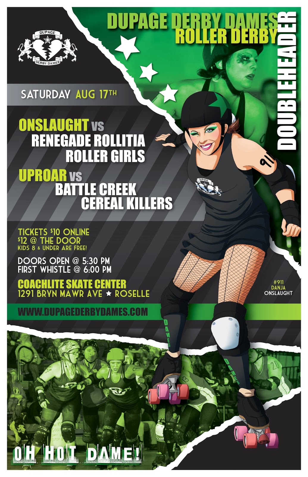
Danja! Danja! (Emergency!)

I've found myself with a rare spot of free time (as limited as it is), so I figured it was due time to update this blog!  Let's get right to it!

This post's skater feature is Danja!

That's pronounced "Dane-juh" by the way.  As in "Danja-rous!"  

For her pose in the drawing, a mohawk (when you skates sideways by turning out your feet, like a ballet dancer) seemed like an appropriate choice.  Sliding by her opponents with just the slightest bit of space on the track was always something that she's excelled at, which is just one of the reasons why she's such a fierce jammer!

A nice little close up for you!
Danja usually wears fairly elaborate eye make-up, or at least something nice and bright, so I made sure to do something similar for the drawing too.  I just wish that a little more of her hair was showing in the drawing because she has a distinct, signature hairstyle with what I think of as "color-blocked" layers of hair.  I have no idea what the actual terminology is...  But anyway, since Danja usually wears her hair in short pigtails, that's about all that usually manages to peek out from under the helmet.

Detail shot of her skates!

At the time that I had originally drawn this, we had the same skates and wheel/toe-stop set up. So that made finding a reference super easy.  I mean, I know I could have just generalized the design of the skates, but I just can't bring myself to do it!  Besides, I think the skaters appreciate the level of detail when they recognize the gear as their own :)  But feel free to disagree!

And here's the final poster that Danja's likeness graced!


Hope y'all digs!  Till next time!


Sunday, October 12, 2014

Beat 'Em Tender Hooligan

Howdy, Friends!  Sorry for the long hiatus since my last post--by my count it's been just over 7 months!  But the break was necessary since my personal life experienced some major changes.  I left a job I had been at for 4+ years, a job that I loved, working with people I adore.  That was ridiculously difficult, albeit necessary.  Then I started a new job and finally bought myself a much needed new(ish) car.  Then I got into an accident with aforementioned new(ish) car...  Fortunately it's all fixed up by now.  And the most recent life change?  Finally moved out a new apartment of my own!  HUGE deal for me!

Admittedly it's still pretty difficult finding much free time for myself, especially when I'm still settling into it all, but my league is heading into it's post-season (and subsequent off-season) soon enough.  And I'm crossing my fingers that it'll mean I'll get more artwork done! But enough about the personal mumbo jumbo that interests no one.  Time for the drawing!

The next feature is Beat 'Em Tender Hooligan!

Not only is Hooligan a rock star jammer, but she's also a lot of fun to draw. Her photos always have this dynamic composition to them, not only due to the wonderful photographic prowess of Steve Jurkovic, but also due to her amazing speed and agility...so I fear that I haven't done her justice with this pose. However, I needed the drawing to fill a taller/narrow space in the bout poster so I couldn't let her pose spread too horizontally.

Those who know (and inevitably love) Hooli know that she has a very distinct style.  She loves Halloween, horror movies, has a taste for the macabre and a flair for the gothic.  So it was important that I acknowledged it, even subtly.

The first thing I did was copy her distinct make-up style.


Though she has been known to go for full-on face paint at times, there are often times where her makeup is left to clean, simple lines and colors (black around the eyes + purple lipstick) that offer a dramatic look without appearing much too fussy or busy. 

They're obviously not real leather--
a body's gotta breathe and a
jammer's gotta juke afterall!
But they look super slick!
Then there are her shiny, leather shorts, one of the most signature pieces of her boutfit. She also tends to wear bold leggings/tights or socks that really stand out among all the black.

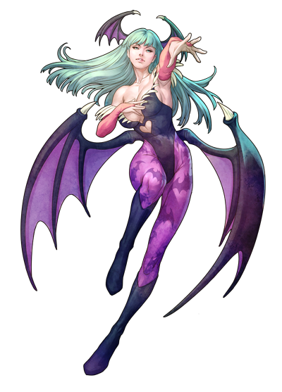
Morrigan Aensland and
her purple batty tights
Some of you might have noticed the reference already, but I based the design of Hooli's tights on Morrigan, the succubus (and arguably the most popular character) from the Darkstalkers video game franchise.  As both are ass-kicking, buxom, femme-fatales with a penchant for the dark, it was hard not to see a connection between the two.    

And in case you wanted to take a peak at the completed bout poster she was on...

Side note: I wish I could have used some of those dynamic photos I mentioned before in green corners, but corners being what they are, the space was extremely limiting.  All the other, better photos would have crucial parts cropped or blocked by text, or just plain wouldn't fit the space properly.  Eh well.  

Hope you guys liked!  And hope I can get back to posting at least semi-regularly.  Fingers crossed!

Tuesday, March 4, 2014

Eleventh Hour

If you know me, you know that my life has more or less been non-stop crazy since...well, always.  So it's much too easy to fall behind on updating this blog.  But I'm here with a post for you now, and that's what matters!

And for what it's worth, there's still plenty more derby drawings that I need to upload.  So let's get to it, shall we?  I give you Eleventh Hour!

#11 - Eleventh Hour
Jammer for The DuPage Derby Dames

Eleventh Hour is one of the most nimble skaters in our entire league.  As she has a background in artistic skating, it really shouldn't come as any surprise.  Time and time again we've all been left in awe at her precise footwork and calm demeanor in the face of track-side chaos.  She practically floats because she makes it all look so very effortless!  I can only imagine just how much better a skater I would be if I could even absorb half her skill.

Here's just a simple little detail shot showing the soft, warm shadows on her skin and the play of light on her hair.   


And here's a little look at the full poster that she graced!


More updates coming soon!  Also coming soon: COMMISSION INFO!!!  :D

Tuesday, October 29, 2013

Emtropy

I'm finally back with another update! Hopefully I'll be able to post several more drawings fairly regularly until I get caught up.  But this is me we're talking about so...we'll see what happens.  Haha.

Now, one of our 2013 League Captains (and Uproar Team Captain), Emtropy, was voted in as the featured poster girl for May.

Yes, May.  Clearly I am far behind on this blog updating business.

Without further delay, here she is!
Bringin' chaos to the universe!
#5X5 - Emtropy!
Detail close-up!
Look at all those shiny pyramid studs!  And the shiny leggings!


We actually just ended our official 2013 bouting season, so as you can imagine, I've done quite a few of these drawings by now.  Even so, Em's drawing is one of my absolute favorites!

I think the reason why I love Em's drawing so much (besides the fact that it's of Em) is that everything about this drawing came together for me.  And it's always satisfying when things work out even better than planned.  But from the pose, to her face, to all the little details that make the image "pop," it all just fit together to make a really satisfying, cohesive drawing.
A detail close-up of her skates


I always put a great deal of effort into these drawings.  Always.  Even so, I still often generalize certain aspects, like safety gear and skates. Em's drawing, however, was the first time that I really took the time to draw out all the hardware of the skates themselves.

Looking at the detail close-ups of the skates, you can see that I made the effort to accurately depict the boot style, plus the shape of the plates.  I even drew in the trucks and the freaking bushings/cushions.  It helped that I have the same skates, and therefore had a visual reference available.  Otherwise I wouldn't have been able to get as specific as I did.  I did leave out the laces/grommets, however, since most of the laces are completely invisible beneath the detachable overlay/lace cover.

I don't mean to toot my own horn or anything, but save for the logo that I omitted, I drew the skates accurately enough that anyone familiar with Riedell skates should be able to tell you exactly what model/set-up it is.  

Seriously.  Go ahead.  10 points to whoever can tell me what boot model that is. 

(Disclaimer: Points are not redeemable for anything other than bragging rights.  Okay, maybe a high-five.)


The final version of the poster featuring Emtropy

Now, last night was actually Em's very last practice with us.  I think I can speak for quite a few people when I say that I am ever so heartbroken to see her go because not only is she just a wonderful person, but her leadership has been nothing short of exemplary.  Still, the heartbreak is made bearable by knowing that her departure is so that she can focus on beginning a new chapter in her personal life.

Em, you've been a truly amazing captain, and it's been an honor skating with you.  When the overwhelming task of training everyone suddenly fell into your lap, not only did you pick up that responsibility with calm and grace, but you helped push us to excel even farther than I think any of us really knew to expect. And you did it while remaining humble, fair, thoughtful, organized (ironic, given your name ;P ) and remarkably patient.  To merely state that I am grateful for all the time and effort that you've put into leading our league seems far too empty a gesture in return for everything you've done for us.  Still, I hope you walked away knowing (and feeling) just how much we all truly love and respect you.

And if not, drop on by a practice soon so we can all swarm you with sweaty, smelly hugs :)

So much effin' derby love to you, Emtropy!  And best of luck in everything you do!

-------------2014 Update! ----------------

I am ever so happy to report that Emtropy couldn't stay away for too long :)  She's back to being a full-fledged member of our league, and we couldn't be more ecstatic! 

Sunday, July 14, 2013

Terrapin Flyer

For April's bout poster, the league needed to vote in a skater from team Onslaught.  The vote nearly unanimously came to Terrapin Flyer, who took her name from a Grateful Dead cover band :)

"If this Dame hits you, you should be grateful you're not dead!"
The pose for Terrapin's drawing was based from one of Steve Jurkovic's amazing bout photographs.  As always, I made some modifications, but the pose was largely left in tact.

Now, it's time for me to make a bit of a confession...

...Normally I do 100% of the artwork myself, and I refuse to use random images pulled from the internet.  HOWEVER, I admittedly copy/pasted part of the drawing from google image search.

OH, THE SCANDAL!

Well, sorta.  It was just the Grateful Dead sticker on her helmet. Seriously, when I'm already averaging 10 hours of work on these illustrations, re-drawing an ornate logo seems like a stupid idea.  Sooo, I think that was permissible, no?

You're free to disagree with me, but I'm going to ignore you.  Just sayin'.

Now, here's the bout poster that Terrapin graced!

As you can see, I returned to the same color scheme as the season schedule designs (green tinted images, black & white striped background).  It just looks slightly less cluttered than when I had the colors "reversed." 

While it's not an ideal image for me to use, I particularly like the photo in the bottom right-hand corner.  Normally I wouldn't want to use a photo of a skater if you can't see her face, but the lines created by that beautiful lunge were just too good to pass up.  Seriously.  Gorgeous.  

Thursday, July 4, 2013

Masochistic Molly & Bully The Kid

2013 brought about a lot of design-specific changes for my league.  Well, and structural ones too, but you're not here to read about any of that stuff, right? 

Anyway, yes!  Design changes!  I mentioned in my last post about how the league did away with themed bouts, meaning that I had the opportunity to develop a set style to incorporate in all of our posters and programs this season. It was also decided that because we have 2 teams (an A-team and a B-team), that we would alternate each month the team that the chosen poster girl was from.  This way we would be evenly featuring skaters from both teams instead of unintentionally favoring one over another.

I ignored this new rule though for our season opener's bout poster.  To kick the season off right, I decided to feature 2 skaters--one from each team.  Let's start off with the skater chosen from Onslaught (our B-team), Masochistic Molly!
"She's hell on wheels...baby she's gunnin for you!" - See more at: http://dupagederbydames.com/skaters/bully-the-kid#sthash.Of3j3E1s.dpuf

#693 - Masochistic Molly!
The post from this drawing was based off of a photo taken of her during one of last season's bouts. I did modify it slightly though so that she was looking more towards the viewer.

I know that I tend to get really anal about small, insignificant details that no one else would care about, and Molly's belt is a perfect example of this.  Despite how carefully I studied images of that belt and how meticulously I counted, I kept getting frustrated with how the different colored blocks didn't line up exactly.  I probably went back and recolored that thing at least twice.  I think I have a problem.  

Anyway here are some close-up detail shots of her lovely tattoos:


I scoured facebook for the best shots I could find of Molly's tattoos, so while these aren't 100% accurate, they're still pretty close...  And I have to say, they were pretty fun to draw!  In fact, they were probably my favorite parts of the entire drawing.

 Now, from Uproar (our A-team), Bully the Kid!
#29 - Bully the Kid!
"She's hell on wheels...Baby she's gunnin' for you!"
"She's hell on wheels...baby she's gunnin for you!" - See more at: http://dupagederbydames.com/skaters/bully-the-kid#sthash.Of3j3E1s.dpuf

"She's hell on wheels...baby she's gunnin for you!" - See more at: http://dupagederbydames.com/skaters/bully-the-kid#sthash.Of3j3E1s.dpuf

"She's hell on wheels...baby she's gunnin for you!" - See more at: http://dupagederbydames.com/skaters/bully-the-kid#sthash.Of3j3E1s.dpuf
In Bully's case, her pose wasn't based on one particular photo, but rather of the mental image I have of her from playing with her on the flat-track.  Bully often takes on the pivot role, taking charge of the pack, so I often picture her hustling back and forth and shouting her orders to rally the troops.

And here's a close-up detail of one of her favorite accessories!  Her dual-pistol belt buckle which just happens to sport a broken heart (like in our league's logo--how perfect).

Bully loves guns!  In fact, I'm pretty sure that she has a tattoo
of one (or two?) on her ankle that I forgot to draw (whoops...)

And here's a look at the final bout poster.

If you've seen the season schedule poster, you may have noticed that a couple of design elements were altered: The colors of the photos and the striped background specifically.

In the season schedule poster, the photos are in a green & black duotone while the striped background is gray-monochromatic.  I swapped that around for this bout poster.  The images were made black & white, and the stripes in shades of green.  The idea was to have a little bit of contrast between the posters without really altering much of the established style.

If I can be perfectly honest, in the end I didn't like this color swap.  Derby posters tend to look very cluttered and busy anyway, but I felt that this actually made it look even busier.  Or perhaps having the photos in black & white made them appear as though they were receding too far into the background.  Either way, subsequent bout posters returned to the former style (green & black photos, gray-scale stripes).

Hope you guys like!  Until next time!


Thursday, June 13, 2013

Two Thousand and Thirteen's Style

So here I am, finally ready to post about the art I've worked on in 2013!  And it's June...Meaning the year is almost half-over already!  Insanity!  I guess I had better get a move on with posting, no?

Now, one of the biggest changes to the artwork I've been creating for the league this season is a singular, consistent style to carry through all of our marketing.  You see, our bout committee decided to do away with bout themes, meaning I no longer had to spend extra time conceptualizing/designing different styles for each bout poster (like the ode to the 80s and Patrick Nagel for "Smack to the Future" or the beer stein and German architectural elements from "Knocktoberfest").  Don't get me wrong, themes are fun and all, but they're so much extra work...and kind of stylistically frenetic.  This season I could actually develop a set style--our branding.

To get the ball (or skate) rolling (har har har), I started putting together designs for season schedules.  In the end I created 3: A poster, a postcard and a business card size as well.  That way we had a solid assortment of materials that we could put on display and distribute with ease.

The DuPage Derby Dames 2013 Season Schedule Poster (11"x17")
Featured: Crissy Crossbones, Masochistic Molly, Roary Feldman, Katzen Jammer
Coincidentally, all of these ladies (and lion) are tall and leggy.  Rawr :3

The fronts and backs of the season schedule postcard and business card
Featuring: Emtropy, Katty WhompAss, Give 'Em L, Kid Vicious and Code Green

The response from my league-mates on the new style has been very positive.  Everyone seems to dig the torn paper look. To get those jagged edges, I actually did rip up strips of paper and then scanned them.  While the use of the torn paper was a literal attempt at creating visual layers without too much clutter (which I admittedly struggle with since I'm an illustrator and not a graphic designer), it was largely inspired by this sort of scene I had running through my head.

I kept picturing this wall outside a club that was just plastered with tons of flyers for exciting events like concerts and all sorts of live performances.  Except all the flyers were ours.  And each time you tore down a flyer, there was still another one of ours underneath. Layer after layer of Dames, shouting, screaming, compelling the viewer to come watch us bout.  No matter how hard a person tried, these posters weren't going to come down--not until everyone's arses were in our seats!  That intensity was what I was hoping to capture in the design.

Question is, did I succeed or fail?     

Now, if you've been following the previous artwork that I've posted on here, you'll notice another big change...

...PHOTOGRAPHS!

At this point we had amassed a decent amount of images from wonderful photographers like Steve Jurkovic, and it seemed a shame not to utilize them!  I edited the photos by adding in motion blurs to draw focus to the featured skaters.  Otherwise the images were largely untouched.

If you're wondering where the skater illustrations went to, no need to worry.  I still draw them.  However, I only do so for bout posters!  And that's what I'll be posting next--the bout poster from our 2013 season opener!  But you'll have to wait until my next update for that one.  It's getting late, and I have a day job to haul my arse to in the morning :P 

Knuckles, Out! 

Thursday, April 25, 2013

Wes L. Mania, Dee Troit Diesel & Annevel Knievel

Our last home bout of the 2012 season was in November, the month synonymous with pilgrims, turkeys and overeating.  Unsurprisingly, it's common to see November bouts take on similar themes.  However, our league decided to take things in a different direction.  Instead, we chose to use our Season Closer to honor our veterans.

I have to say that our season closer went even better than any of us could have hoped--We really went out with a bang!  And I don't even mean because both of our A and B teams emerged victorious (though double victories are always fantastic).  A local VFW came out to perform the national anthem, veterans were treated to discounted tickets, and The Chicago Riots Junior Roller Derby team play mini bouts during our half-times to a completely packed house.  But enough about the bout, let's get to the art.  That is why you're here after all.  Well that, and because I'm just that cool.

Nah, it's for the art.  Let's be honest here.  

Because this was our season closer, I really wanted to do something extra special for this poster.  So, instead of drawing just one poster girl, I drew 3!  Er, sorta.  More like 2 skaters and 1 referee (who just happens to be a dude):  Dee Troit Diesel, Annevel Knievel and Wes L. Mania!

The original sketch of Dee, complete with a myriad of notes
Dee in color!
Annevel's original sketch.  Pay no attention to the tiny ninja thumbnail in the corner.
I said stop looking at it!
In color and rocking her trademark flag legs!
By now she has a new Evel Knievel style helmet that's just as patriotic.
God Bless 'Merica!

Wes' sketch
Wes in color!
So why the decision to feature a ref instead of 3 skaters?  Well, refs and NSOs are just as vital to a roller derby league as its skaters--bouts and scrimmages just don't work without them!  However, they tend to get a lot more crap (and from both teams) if skaters don't agree with calls they've made, or failed to make as the case sometimes is.  Roller derby is an incredibly complicated and intense sport, so this happens a LOT.  That alone is enough to deserve a feature, don't you think?  And if you disagree, well, our refs are effin' awesome, too.  So there. 

With having pushed myself to draw not 1, but 3 different people on this poster, I was once again left without enough time to shade them.  I hate leaving drawings in flat colors unless that was what I had intended from the beginning... :/  Even so, the rest of the poster still turned out okay.

Thanks to this poster, Wes, Dee and Annevel get requests to recreate these saluting poses for photos.  Even now, several months later.  In fact... 

Wes, Dee & Annevel throwing their salutes at a bowling outing a couple of months ago.
And yes, they're wearing matching Hawaiian shirts...
This wasn't even an official roller derby related event.  We were all just hanging out, haha.

Hope you liked!  Now, time for my shameless plug!

This Saturday I'll be skating in the American Cancer Society's Walk & Roll in Chicago!  I skated in this last year as well, and not only is it a lot of fun, but it's for a good cause!  I mean, c'mon, who doesn't want to kick cancer squarely in its junk?!

My goal this year is to raise $100, but as of this moment I'm still not even halfway there.  And I only have 2 days left!  So if you happen to be able to spare even just $5 for a donation, I'd really, truly appreciate it!  And not just me!  Everyone who has ever fought with or been touched by cancer. 

If you'd like to make a donation to the American Cancer Society, just click here

To anyone who has already donated, and to those who will, THANK YOU :)

Monday, April 15, 2013

Crissy Crossbones & Knocktoberfest

Whhhat?  Another new post already?  Why yes.  Yes there is.

I'm itching to get this art blog up to date with this season's artwork, but I don't want to skip over any of the drawings I've done in order to do so.  So, I'll be plowing through the last few from last season within the next couple of days.  It's not exactly a consistent posting schedule but...eh, whatever.

Anyway, our bout committee decided on "Knocktoberfest" as the theme for our September 2012 home bout (contrary to the cognate, Oktoberfest actually takes place in September).  Besides the fact that the timing was right, this bout also happened to kick off the beginning of beer sales.  That's right, we serve beer at our bouts!

Selected to be our poster girl this time around was Crissy Crossbones.  While most of the other skater drawings I had done consisted of more dynamic "action" poses, I decided that I wanted to take a different approach with Bones.  The plan was to draw her reclining back in a giant beer stein :P

 
As you can see here, I drew the original sketch in a humble notebook. Haha.  For whatever reason I'm almost disappointed that the notebook lines didn't really show up in this scan though.  I have no idea why.

Bones' drawing was actually the first time I had to incorporate a tattoo (butterflies on her right shoulder).  Well, I didn't have to.  But if I was going to put as much effort into these drawings as I had been, it seemed wrong to leave out something that was permanently inked onto her skin.  But I digress...

Anyway, because I try to create a believable likeness in these drawings, a bit of a predicament arises whenever the poster girl has a tattoo or some other distinguishing physical trait.  That is, I have to scour their photos in the hopes that I can find some where it is prominently featured.

Of course the easier option would be for me to just take a photo if them myself, only it takes away some of the mystery and surprise of the poster girl's identity.  It's supposed to be a secret until the poster is revealed, so going around snapping photos of someone's body parts seems a bit telling...

I run into the same problem time after time with eye color as well.  As much as I love my teammates, I don't stare into each and every one of their eyes meaningfully enough to memorize what color they all are.  So sorry, Ladies, if I've ever used the incorrect eye color for your drawings.  But at least now you know why.  

Time was (as it always does) working against me, and I had to leave Bones at flat colors in order to meet the deadline.  But like I did with Speeds Kate's drawing, I plan on going back in at some point to give her a full-shading treatment.  I just hope it doesn't take me 6 months to do it...

Bones "modeling" our new jersey style

Even though I did save a bit of time by leaving the drawing in flat colors, that time was probably eaten up again by some of the detail work.  Besides custom-made leg-warmers with her skater name and number, she also had these decals on her helmet that spelled out her name in some sort of skeleton/bone font.  I still don't actually know that I found the correct one, but if anything it's awfully close.  The number on her helmet was doodled in, however, because the font's numbers looked a little too different.   At least, I think that's why.  Maybe the font didn't even include the numbers?  It was so long ago by now I really can't remember.

Here's a close-up detail of the helmet decal.
Huh, never noticed until now that I had it running into
the holes in her helmet... -_-*

Now, aside from drawing a giant beer stein, I really wasn't too sure of how to incorporate Oktoberfest into the design.  My knowledge base of Oktoberfest in general was (and still is) pretty limited.  So I took to the internet and consulted my good friend, Google Image Search.

What I kept seeing over and over again were patterns made of white and light blue diamonds, orange flags and busty lederhosen-clad fraulein.  Yeah, was not going to incorporate that last one...  But the diamonds and orange flags--no problem!

There was an attempt to incorporate German architectural elements into the design as well, but unfortunately most of that was blocked by the orange banners.  Still, you can see bits and pieces of it at the very top and bottom of the poster design.
The final bout poster for "Knocktoberfest"

Looking at the poster, I should have drawn Bones and the beer stein at the same time.  I purposely drew them separately to allow for compositional flexibility, but as a result I feel like her seated position isn't convincing.  Not in this particular stein anyway.  Eh well.  Lesson learned.

Fonts Used: Germanica, Market Deco